Studio 2.0

It was being in a city rife with artists that brought me back to painting after a couple of decades in the soul-sucking employment of corporations and start-ups. Once I tapped into the buzz, the creative current that seemed to run below the streets like buried wires, it became easier to migrate to less conventional ways of making money. I will walk dogs and be an herbalist, thought I. And I acclimated, and I put down some roots, and then one of my roots hit a live wire and I took out all of my old paints and brushes. The next thing I knew, I was hanging my work in a local cafe and people were contacting me about doing a painting for them.

I shared studio space in an old brick building with about 30 other artists. I loved the smell of art supplies that permeates a studio, the area rugs thrown down over concrete floors and couches to flop on for a neighborly conversation or a quick meal, the communal slop sinks, the echo of footsteps late at night in an otherwise crypt-like building to remind me that I wasn’t alone, the 10-minute walk home down busy, tree-lined streets which were quietly still at midnight. We don’t become nostalgic for places until we leave them, and I have to admit that even in the 20- and 30-degree temps of December, I miss the cement floor and brick walls of an old studio building.

Moving to Plymouth, the cultural contrast has taken some getting used to. Of course, there are no studio buildings down here, and I set up in a spare room of my home. The art scene lacks vibrancy, vitality, visibility. It feels old, with its seascapes and florals, and I found myself missing that current I could just tap into, the inspiration of energetic and unique artwork. Here, I need to make it, myself. After working on commissions for 15 years, the gift of this new location is the prompt to start prioritizing my own art instead of work that others want me to paint. Don’t get me wrong — I gain a deep sense of fulfillment by creating paintings that bring joy to the client, and I will always do so. But now I can’t rely on my environment to keep me inspired. It took a while for me to figure it out, but it’s time to reinvigorate and rethink. Experiment. Play. Screw up and try again. Have fun.

The front room with its bay window facing southeast provides great light for plants and for painting. It’s a lot smaller than my city studio, but the lighting is better, and I can step into it merely by walking through a room or two. It doesn’t require monthly rent, which is always a plus. I can look out at the snow in the winter (gorgeous even when there are 30 inches of it). And now, it is the home of an entirely different approach to painting.

Royce (30 x 48” oil on canvas)

Different paintings work up at different rates for different reasons. This one took twice as long— and then, as it was near completion, it seemed that every time I thought I was done, I saw another part that I needed to work on. And so it went, day after day… changes that may not be noticeable, but altogether I think it tightened up the visual. This painting is for a charity auction (for the Greater Swiss Mountain Dog Club of America Health Fund, which allocates funding to research health conditions in the breed), the winner of which serves as the display example for the next year’s auction.

We went back and forth a little on whether to straighten the harness. For those not familiar with drafting events, this dog had just been crowned the winner of a weight pull, which requires a very large and very heavy harness specifically for weight pulling. They’re thick and padded and not fitted snugly, and long, trailing back in a -< that enables a clear distance from the cart they’re pulling. The cart itself doesn’t contain one simple layer of cinder blocks, but layers added upon layers as each round advances and fewer dogs continue to succeed in pulling the added weight.

There was a good argument for straightening the harness. Aesthetically, it would meet the eye in a more pleasing manner, I suppose. Then again, jumping atop a cart loaded with over 4.000 pounds of cinder blocks that he had just pulled, a harness like that would fall askew, and it was the candid image of the crooked harness and little plastic crown slipping off of his big noggin that I felt really conveyed the moment. It’s valiant and majestic, happy without any need of fixing, and maybe a little dose of goofy, exactly as is the breed he represented so well.

People’s Choice Award

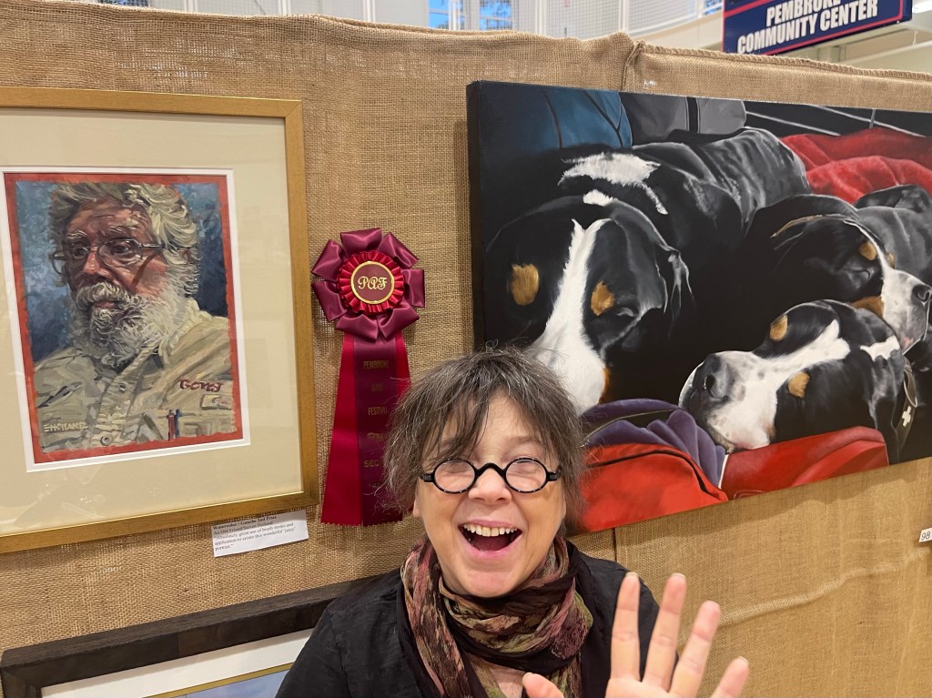
I won the People’s Choice award at the Pembroke Arts Festival this past weekend.

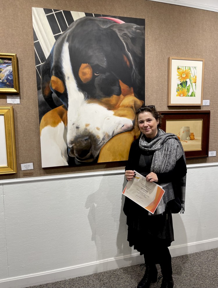
I wasn’t awarded anything by the jury, so I attended opening night just to roam and ogle the artwork — which is always superb. I went with a friend who inspired me to take a watercolor class with her from a teacher she preferred. As an oil painter, watercolor is The Devil, but I liked that his style taught me to open up, not be so constricted and careful with my brush strokes. I’m still horribly inept at watercolor, but I really enjoyed Tony’s classes and his personality. Anyway, we’re cruising around at the Pembroke Arts Festival, and as we rounded the corner to the area where my work was hung, there it was next to a portrait of him (An Old Friend, by Stephen Holland), which had won 2nd Place in the Watercolor category.

So of course I had to stand there like a fool, laughing as my friend directed me to move to the left, go lower, whatever, waving to our watercolor teacher so that she could post me on social media making an ass of myself and tag him. I found out a few days later that I’d won the People’s Choice award, and wished that I had attempted a pic more professional to post, but I’m beginning to think that the goofy pic is better than a serious and centered (and more boring) one.

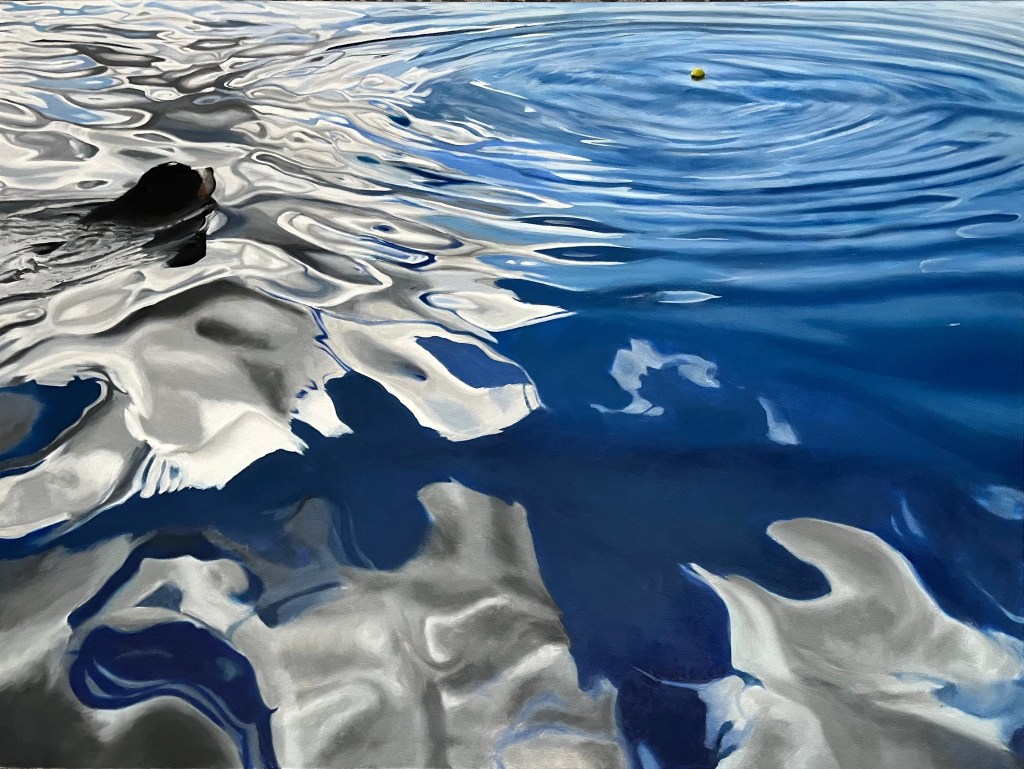
Reservoir Dog (48 x 36″ oil on canvas)

I had been working on this painting for quite a while, between other paintings. I thought it may be a great exercise to free up my brush strokes, to learn to go with the (literal) flow in getting lost in the swirly reflections and ripples of the water, but instead I found myself spending way too much brain space on the geometrical coordinates and relationships of the whites and grays and blues, just because that’s how my brain paints.

I fight it and complain about it and long to just be a freer painter, and whenever I do that out loud to another painter, they remind me that this is my style and just embrace it.
And I guess they’re right.

What’s in a Name?

I’ve been blessed with receiving awards in gallery shows in recent years, and it has helped me (and the self-reproach of my inner critic) to value my work more.  One of the things about artists (not to speak for all of us, but you know…) is that we are never finished with a piece.  For this painting, I seem never to be finished with its name. 

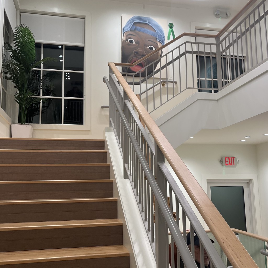
Originally, I called it Red, White, and Blue based on the visual colors but also the obvious deeper meaning of how this nation has treated those who are not white.  This only works as long as you see his expression as more WTF than playful. 

Then I changed it to Your Black Friend, because the subject did put himself out there as just that (see this); but again, that works only as long as the viewer reads his facial expression as “Did you really just say that?”

I submitted it to a local gallery well outside of the city for its annual juried show — one I’ve been proud to receive awards from in the past couple of years — under that name. As I feared, it was not accepted. I have to say, I consider this painting to be representative of some of my best work. But it’s big, it’s in your face, and perhaps a little “too much” for a more buttoned-down part of the state. I tried to chalk it up to just being not accepted against a lot of very good submissions by very talented artists, and pushed my anger aside as unfounded and egoic. Who the hell am I to be frustrated that my painting wasn’t accepted to a show which gets a lot of great entries?

But I was then determined that this painting would hang in that gallery, so I paid my membership dues and submitted it to the very next members’ show (which are not juried). This time, though, I didn’t title it. It was submitted simply as Untitled, and when I walked it in to drop it off, everyone oohed and aahed over it.  It was hung on the stairway inside the entrance to the gallery and awarded an Honorable Mention.  

The award was given by someone or a group unaffiliated with the jurors of the Annual Juried Show and is very much appreciated.  It does make me wonder, though, if it would have been accepted in the previous show if I’d simply left it untitled. While there is a part of me that says my work simply wasn’t good enough to be accepted, there is a practical part of me that says that, as an artist, I just need to know my audience. And there is the part that asks why it should matter.

Best in Show!

It was such an honor to have my painting The Side Eye chosen as Best in Show by the jurors in the “Autumn National 2024” juried show at the Cape Cod Art Center. They receive hundreds of submissions to this show each year, and I’m always impressed with the quality of the works chosen, so it certainly came as quite a surprise.

Mingling after the awards presentation, one of the jurors approached me and expressed how taken they were with my painting, saying that it was never even a question from the moment they entered the gallery. We as artists are often so doubtful about the eligibility of our own work, and it was a good reminder that moments like these often go unspoken; so I was so appreciative to have been told that.

This was my second Best in Show in a year (the other being a members show in my local gallery). I tend to focus my time on commission work, but I’m starting to think that I should spend some more time on paintings for gallery shows!

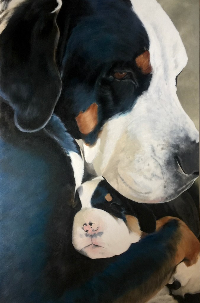
Baby Filia (30 x 48″)

I feel like this is my Madonna and Child of dog paintings. This was one of those commissions in which we were both in immediate agreement of which photo to use. With “adopt, don’t shop” as the battle cry of mixed-breed and rescue homes, this image offers a peek into the whelping box of a responsible preservation breeder, where all of the needs of mom and pups are met — especially love and comfort.

Snuggled

April 19: I got a little lost on details (as usual), and started playing with things I’d already finished. I have pearlescent ink which I wanted to try on the pearls… but that didn’t really go as planned! But it’s now completed and waiting to dry a little before transporting it to NJ.

March 26: Some progress on Caboo. I wanted to name it Boo, but didn’t want to imply fright since her posture can resemble a sense of fear and her eye may need to be relaxed a bit (what do you think? Post in comments!). I failed to take a pic of the sketch, but here the color mapping is complete and some work has been done on the couch, tans, and white. I almost forgot her signature pearls, but I’ve outlined them in and will add a couple (though shadowed) under her chin!

People are often surprised that I work upside down, but it really helps to lose subconscious preconceptions of where lines and curves are supposed to go… because so often our brains are wrong. Anyway, I’m posting this to show the actual status in the studio: painting upside down, photo above for reference, early afternoon light beaming through the window.

As layers are added, colors and shading improved, and details corrected, I’ll post more updates. Since changing studio hours to morning, my time there is more productive and I’m hoping to start whipping through paintings more quickly to catch up from the pandemic lag. This painting should be done within two weeks.